1
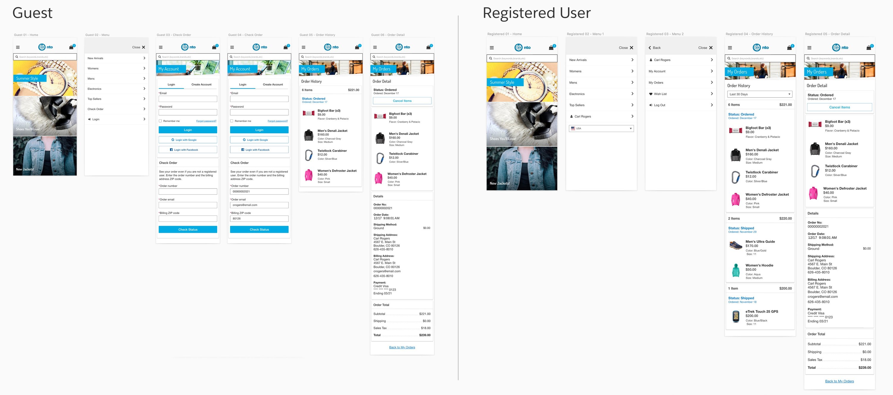
Guest & registered
Checking order status
Shoppers can check an order whether or not they’re logged in. Guests look it up by order number, and registered shoppers go straight to their order history.
Case Study · Mobile Commerce
Letting shoppers check, change and track their own orders, without calling customer service.
The Challenge
Shoppers needed a way to check order status, track shipments and cancel or return items on their own, right in the store app. Every self-serve task meant one less call to a customer service rep, freeing them up for harder issues.
Shoppers expect to track or change orders on their own, as easily as they do on Amazon.
Several technical constraints and few existing patterns to build from.
Routine order questions tied up reps who could be helping with more complex issues.
Fun fact: “Your Orders” is the most visited page on Amazon.
The Goal
Make order management feel built in, not tacked on.
New flows had to use the app’s established patterns, with close attention to detail, so they felt like they had always been there.
Requirements
View order history, status and details, as a guest or a registered shopper.
Cancel items that haven’t shipped and see the refund amount up front.
Follow a shipment from the mobile app or the desktop storefront.
Process
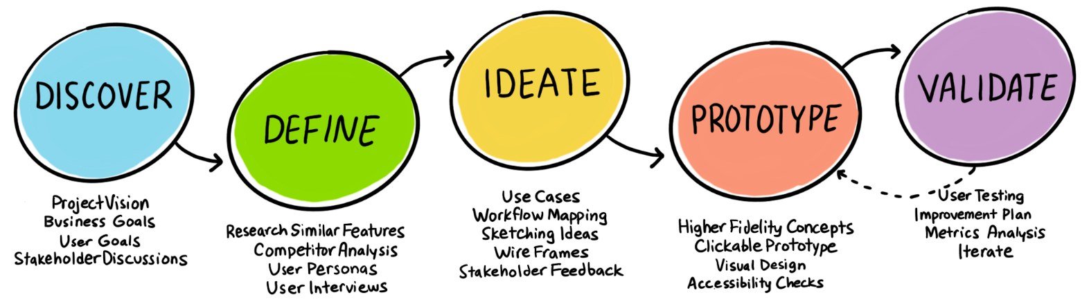
I started from research provided by my UX research lead and spent time in a sandbox version of the app to learn its flows and patterns. From there we wrote use cases, then worked through rounds of low-fidelity wireframes with regular stakeholder check-ins.
Persona
Working with the PM, we defined our persona as an online shopper who would rather handle orders himself than call customer service.

“I love being able to check the status of my order and even make changes to it without having to call a customer service rep.”
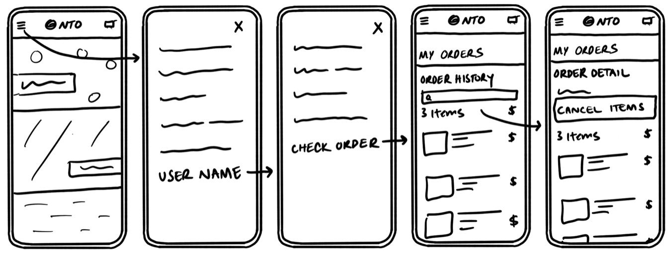
Wireframes
Lightweight wireframes let us test ideas quickly, before changes got expensive in high-fidelity mockups.
The Solution
Shoppers can check an order whether or not they’re logged in. Guests look it up by order number, and registered shoppers go straight to their order history.
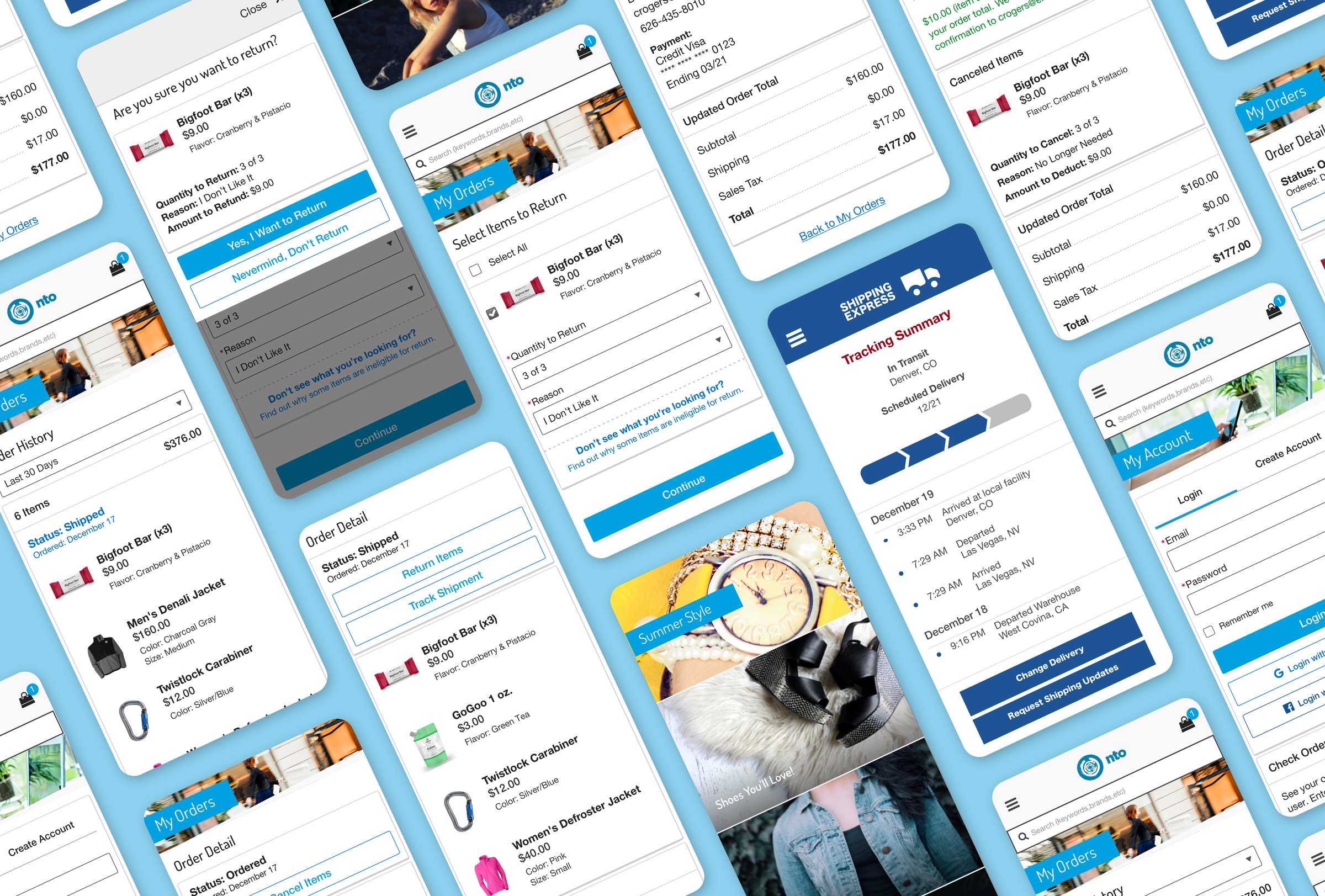
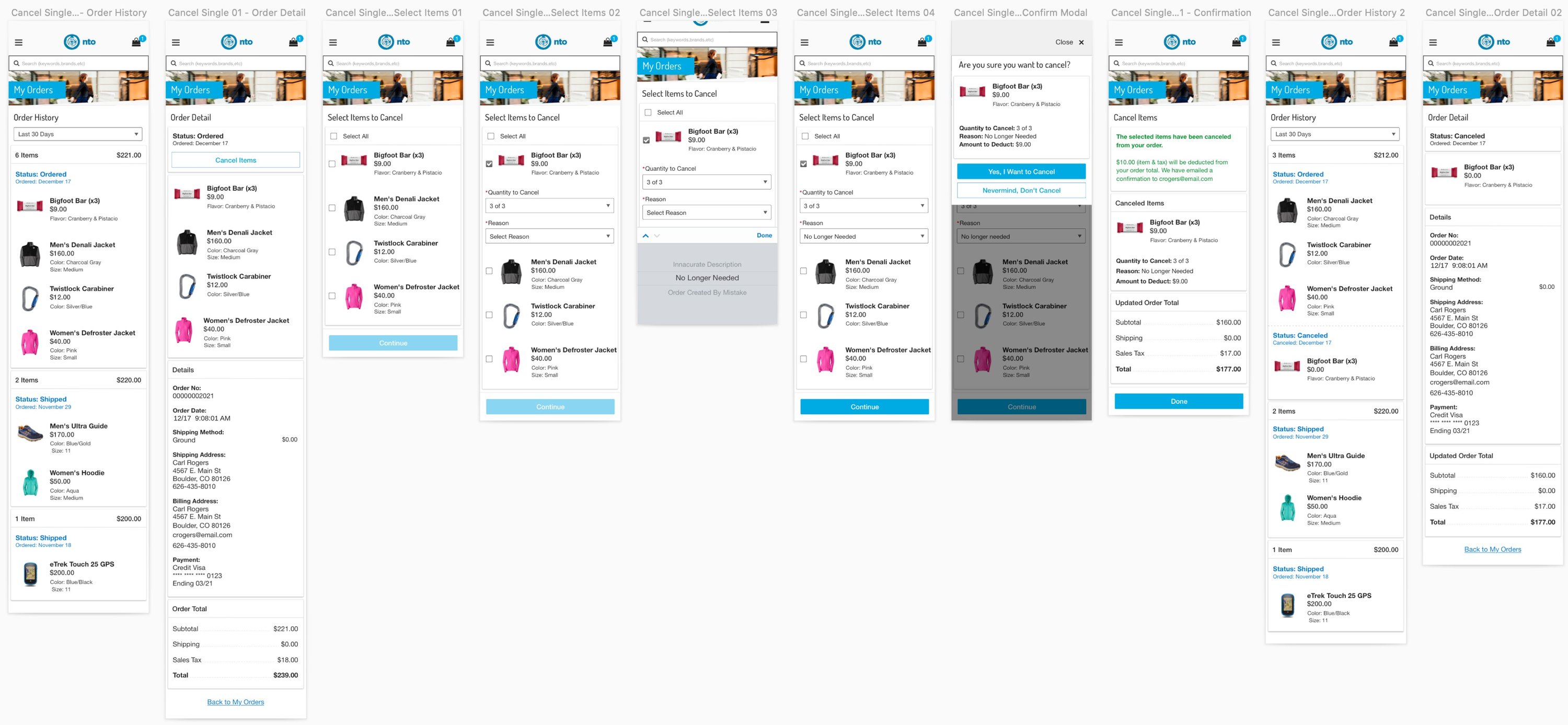
Shoppers pick the items and quantities to cancel, give a reason and see exactly how much they’ll get back before confirming. Returns follow the same pattern, plus a return shipping step.
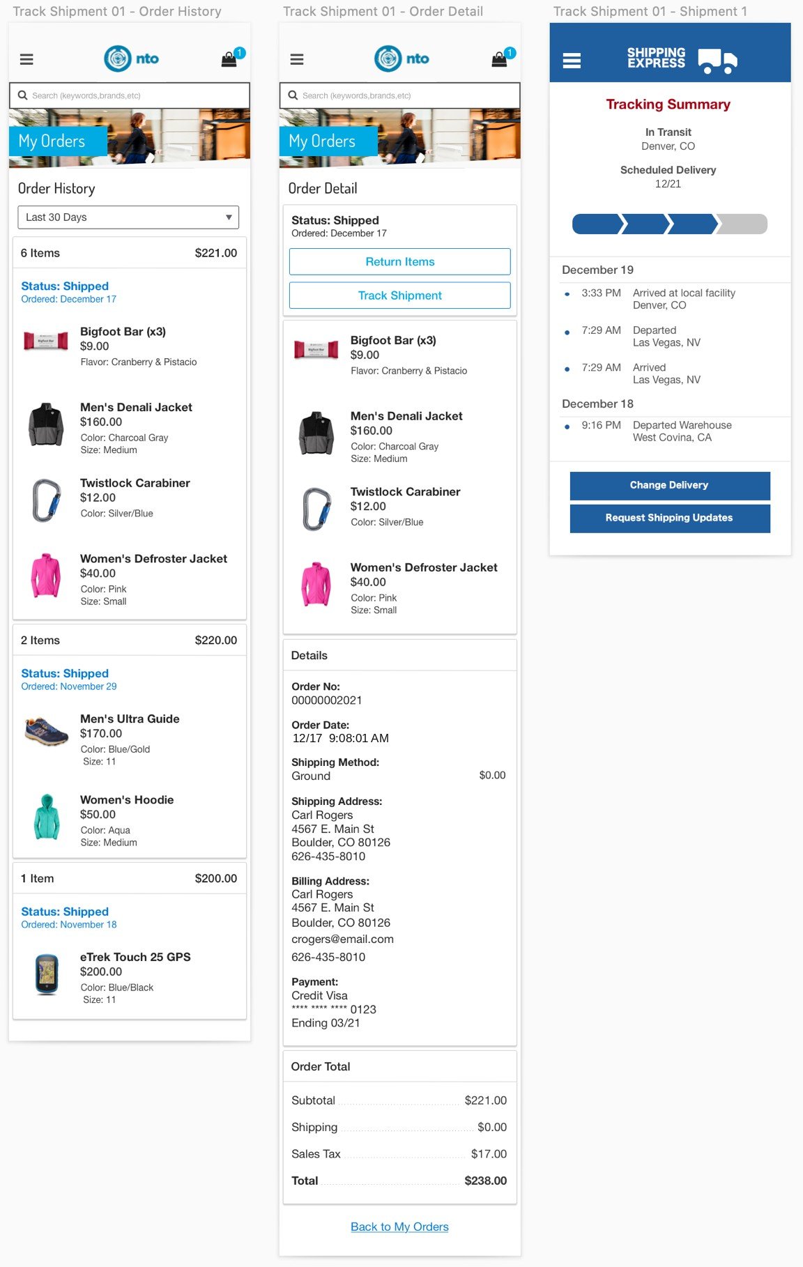
From order detail, one tap opens a tracking summary with delivery status and every stop along the way.
User Testing
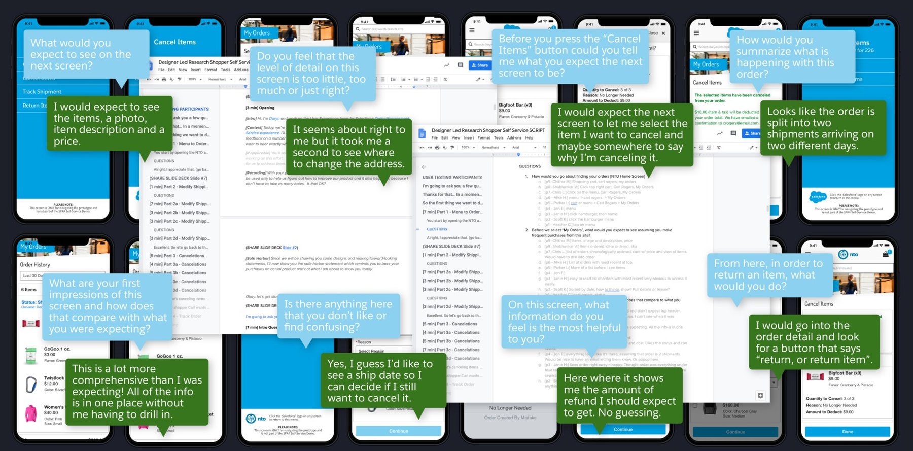
I ran one-on-one sessions with 12 participants of varying backgrounds and technical comfort, using an InVision click-through prototype and a scripted set of tasks. The sessions confirmed what was working and surfaced a few pain points, which I iterated on before moving to high fidelity.
Research Findings
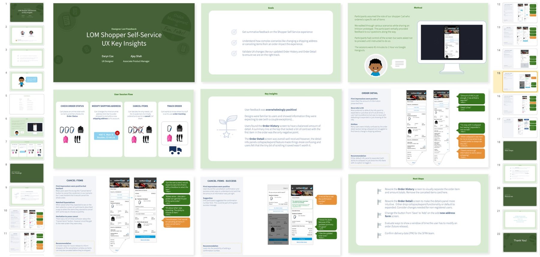
I packaged the findings into a slide deck and presented it to stakeholders, the extended UX team, PMs and development. It became the single source of truth for the MVP.
Responsive
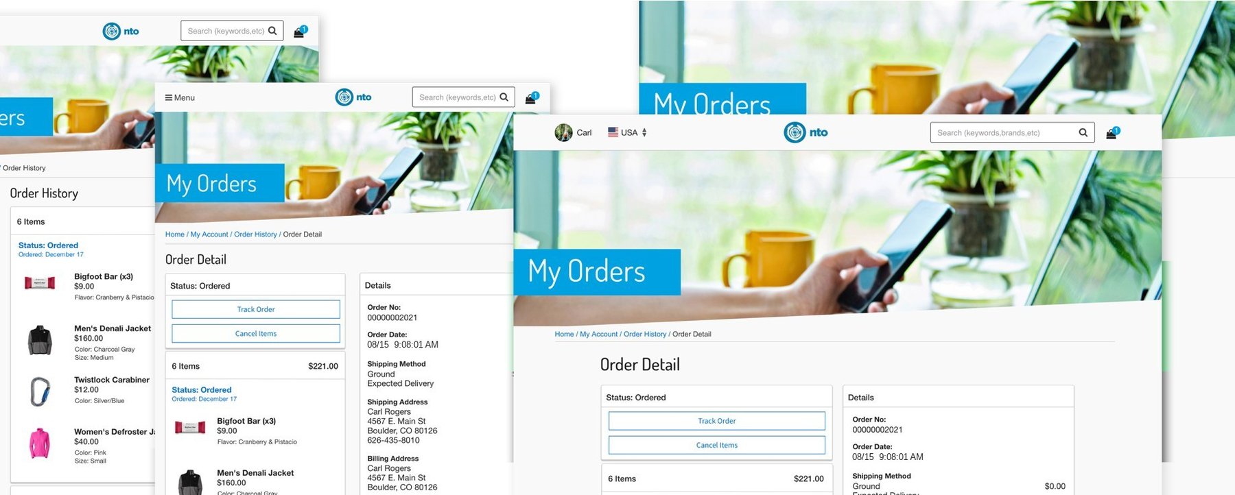
The flows were designed mobile first, then carried to tablet and desktop. I created responsive concepts of key screens to guide developers and stayed available throughout the build.
Outcomes
12 one-on-one sessions shaped the flows before development began.
The findings deck gave the whole team one shared reference for the build.
Responsive concepts guided developers across mobile, tablet and desktop.
Questions about this project, or just want to compare notes? Reach out.