Salesforce: Shopper Self-Service
Company:
Salesforce Commerce Cloud
My Role:
UX, UI & visual design. Click-through prototyping. User testing.
Tools:
Sketch, InVision, Photoshop & Google Slides
Problem
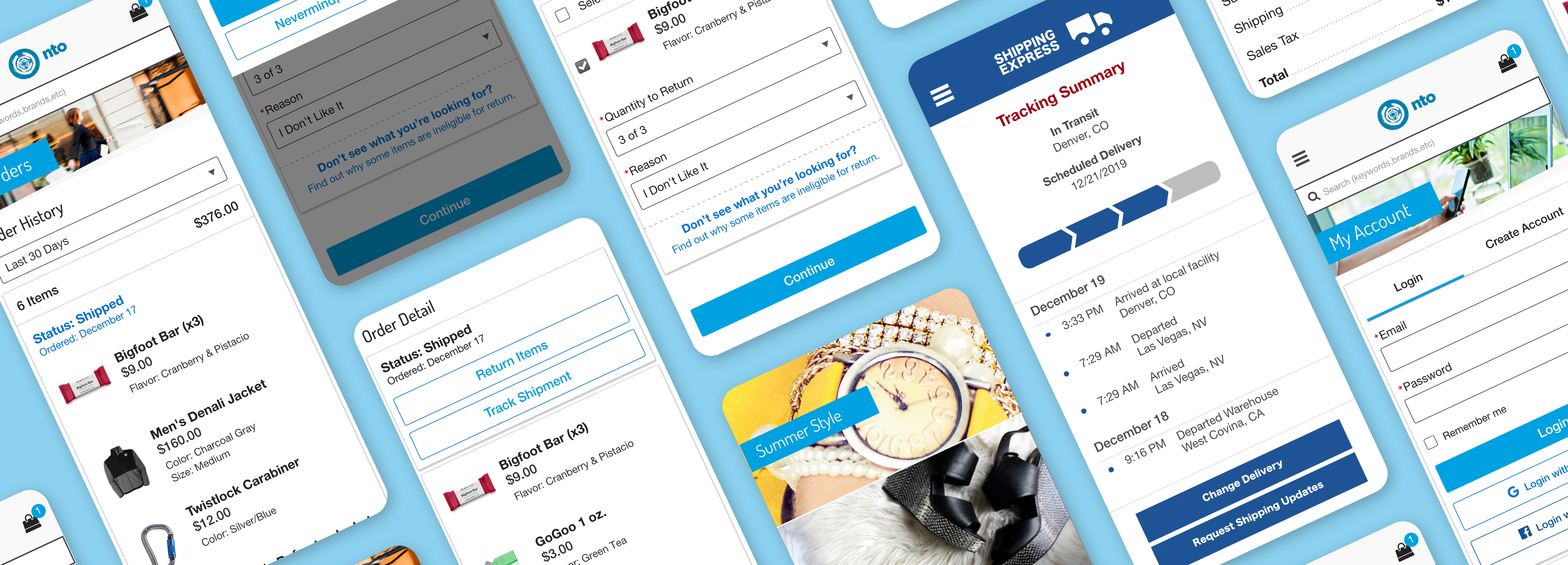
Starting with an existing mobile shopping app interface the team needed to seamlessly add in order management functionality to provide shoppers with a way check the status of an order, track shipments and make order modifications such as cancelations or returns by themselves through the store app. This allows shoppers to avoid having to call in and speak with a Customer Service Representative which had the added benefit of freeing up call volume allowing CSR’s more time to assist shoppers who had more difficult service issues.
Design Process

Persona
Working closely with the PM for this project we identified our user persona as an online shopper who is savvy enough and prefer to handle tasks like viewing orders, canceling items from orders, returning items from orders and tracking shipments via self service rather than calling in to speak with a Customer Service Representative.

Challenge
Self-Service functionality needed to include: Ability for a shopper to view their order history, order status and order details as both a guest and registered user. They must be able to easily cancel items form an order that has not yet shipped, return items that have shipped and track a shipment through a mobile app or desktop version of the storefront. They must also be able to easily understand the financial implications of any order modification they make. Adding in the order management functionality would of course need to look seamless to the user and not appear tacked on, attention to detail and consistently using established patterns would be high priority while adding new user flows.
Wireframes
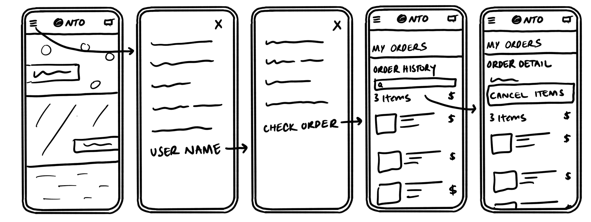
Light weight wireframes help us rapidly prototype potential solutions before a lot of time is spent on higher fidelity mockups where things can be more ‘expensive’ and time consuming to make changes.
Solution
Starting with up front research provided by my UX Research lead I needed to fully understand the existing storefront application in order to come up with the best solution for fitting in the order management functionality. This included gaining access to a sandbox version and spending some time using the app to understand user flows and design patterns being used.
Next the team created several use cases based on our requirements and user persona, the online shopper.
We followed by a few rounds of super low fidelity wire frames and mockups. During the entire process I kept in close contact with key stakeholders including Product Managers, Development Lead and others.
After several iterations with the low fidelity versions I moved on to creating a click-through prototype using InVision and ran a series of user testing sessions to find the pain points. I then iterated several times before the solution was far enough along to move onto high fidelity prototypes where and more user testing until we had the right solution for our user problem.
User Flows
Checking Order Status
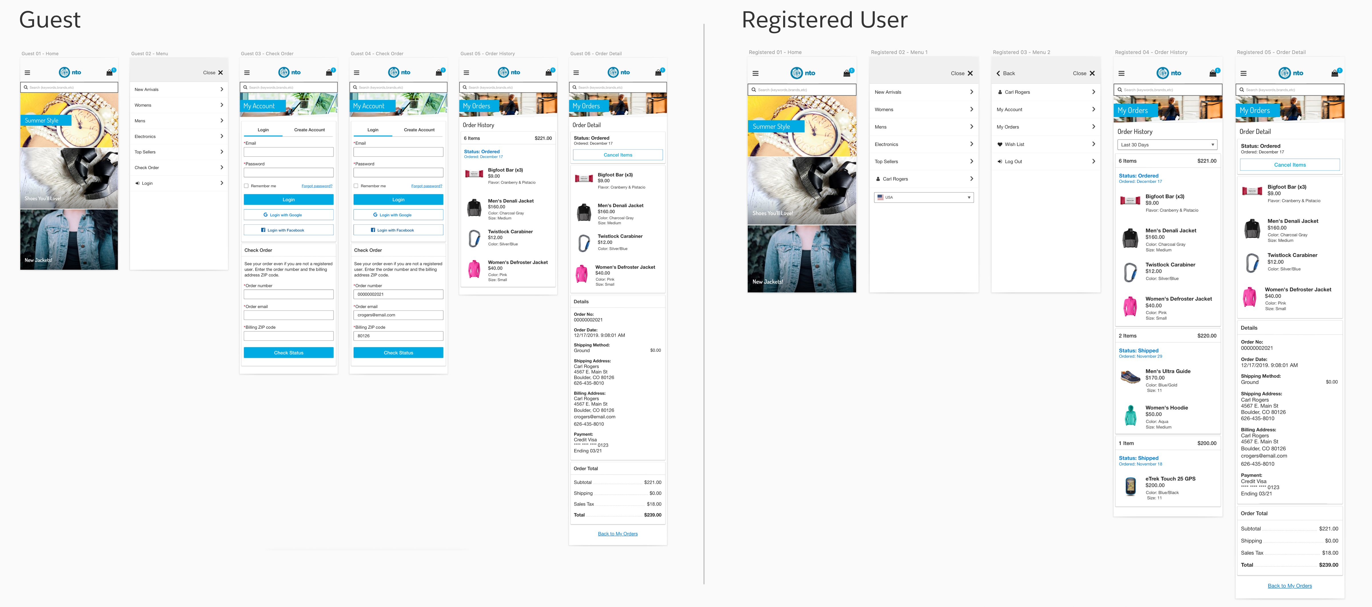
The shopper needs to be able to check the status of their order whether they’re logged in as a registered user or not.
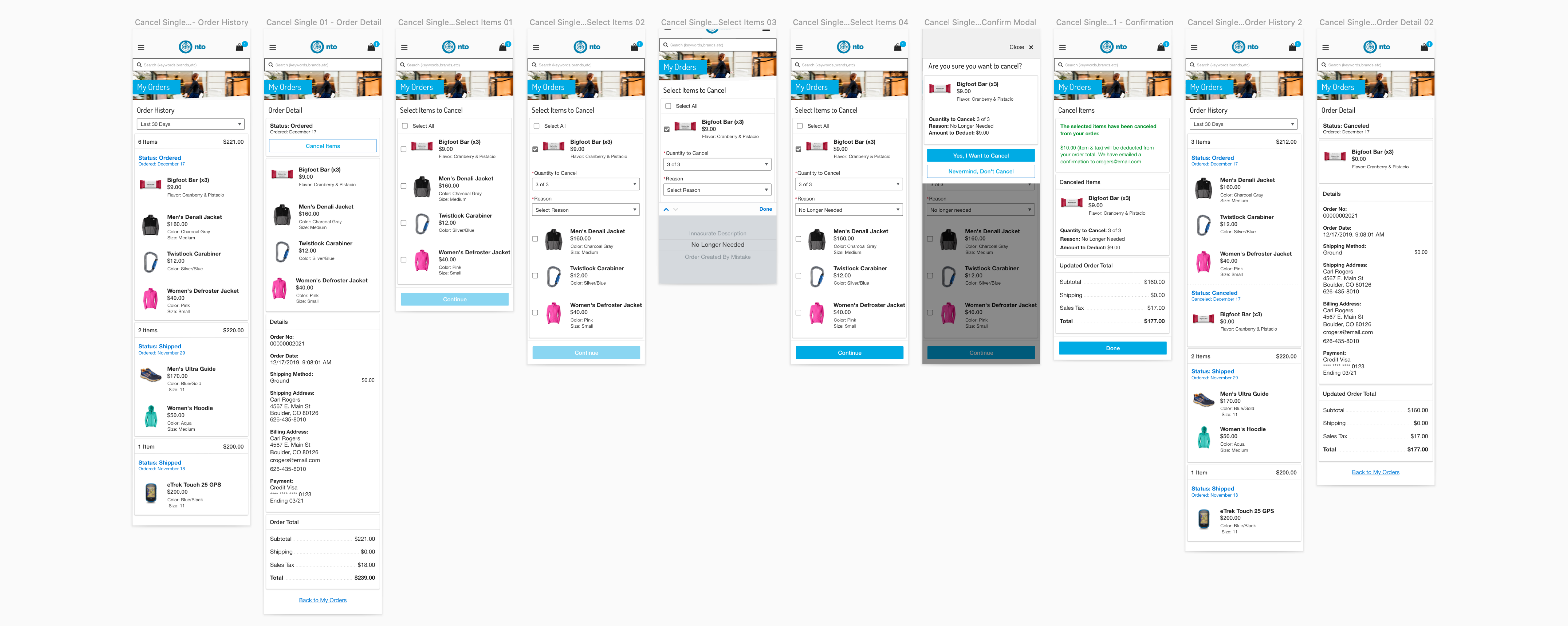
Cancel Items
They need the ability to cancel items that have not yet shipped. The user flow for returning items follows the cancel items pattern almost exactly except for where the shopper selects their return shipping method.
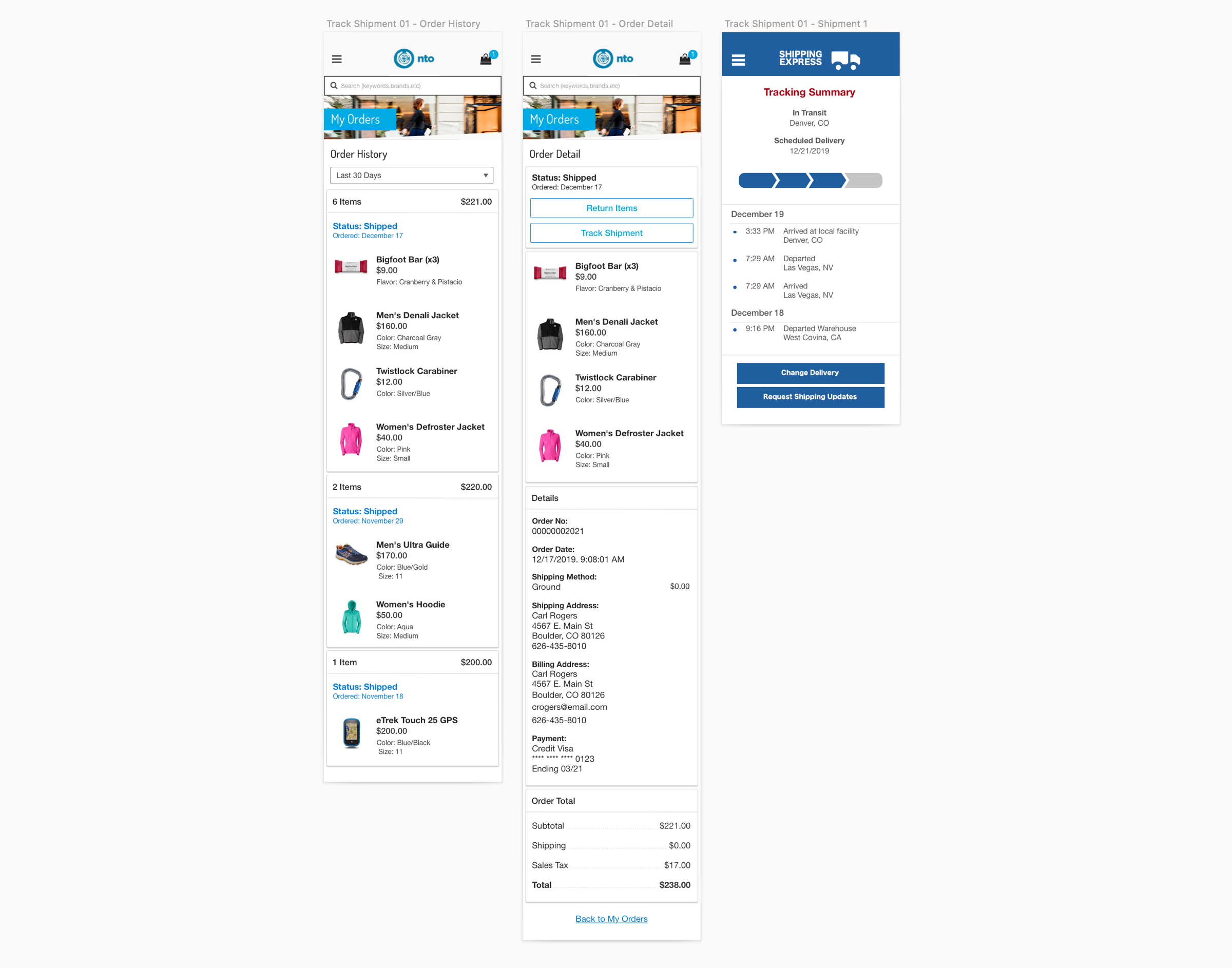
Track Shipments
Naturally the shopper would need an intuitive way to track shipments
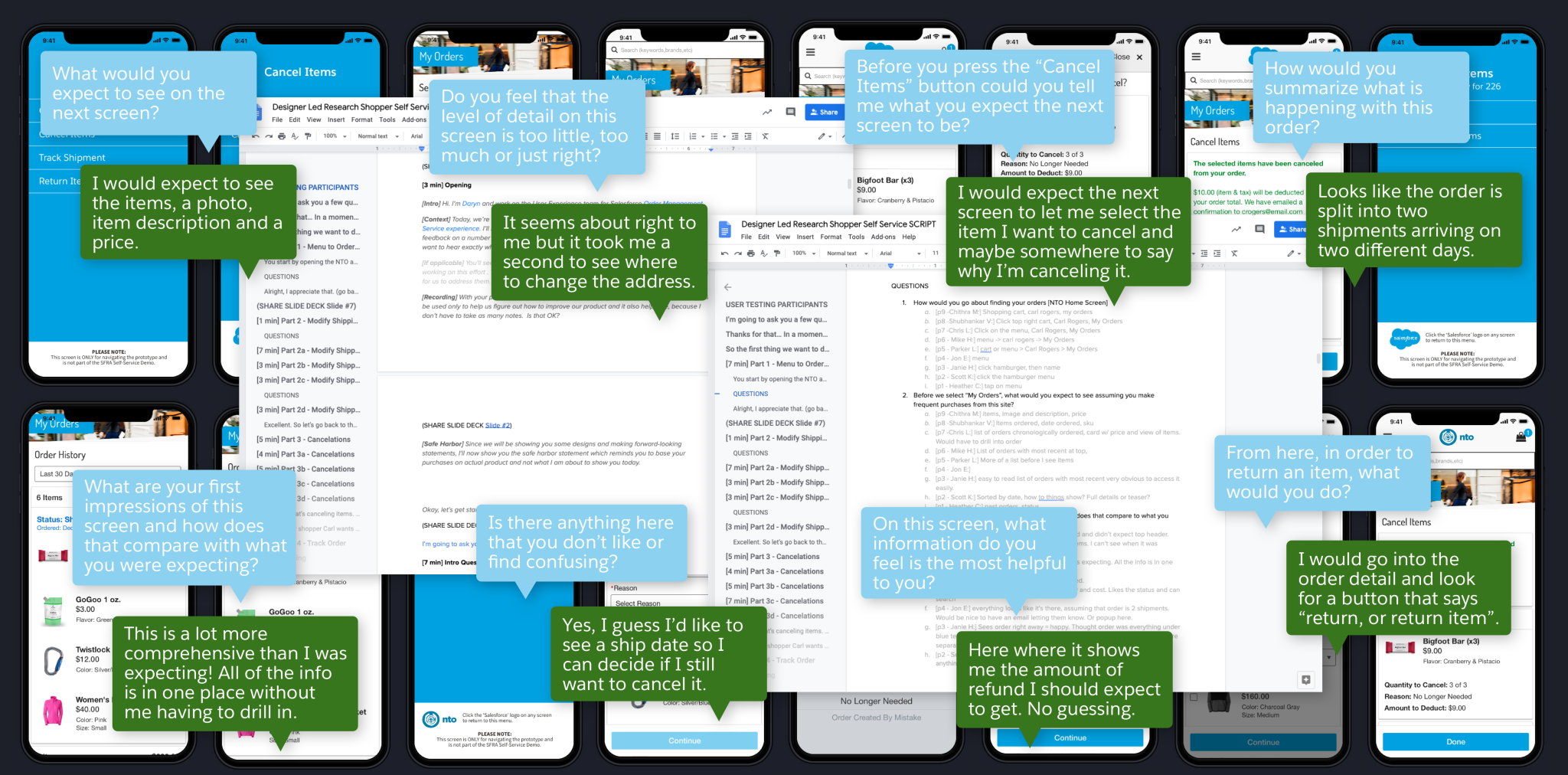
User Testing & Prototype
Using a click-through InVision prototype along with a carefully curated script I conducted 1 on 1 user research sessions. For this I recruited 12 participants all with different backgrounds and technical aptitude. Naturally the results of the user testing revealed a few pain points as well as areas that were working as intended.
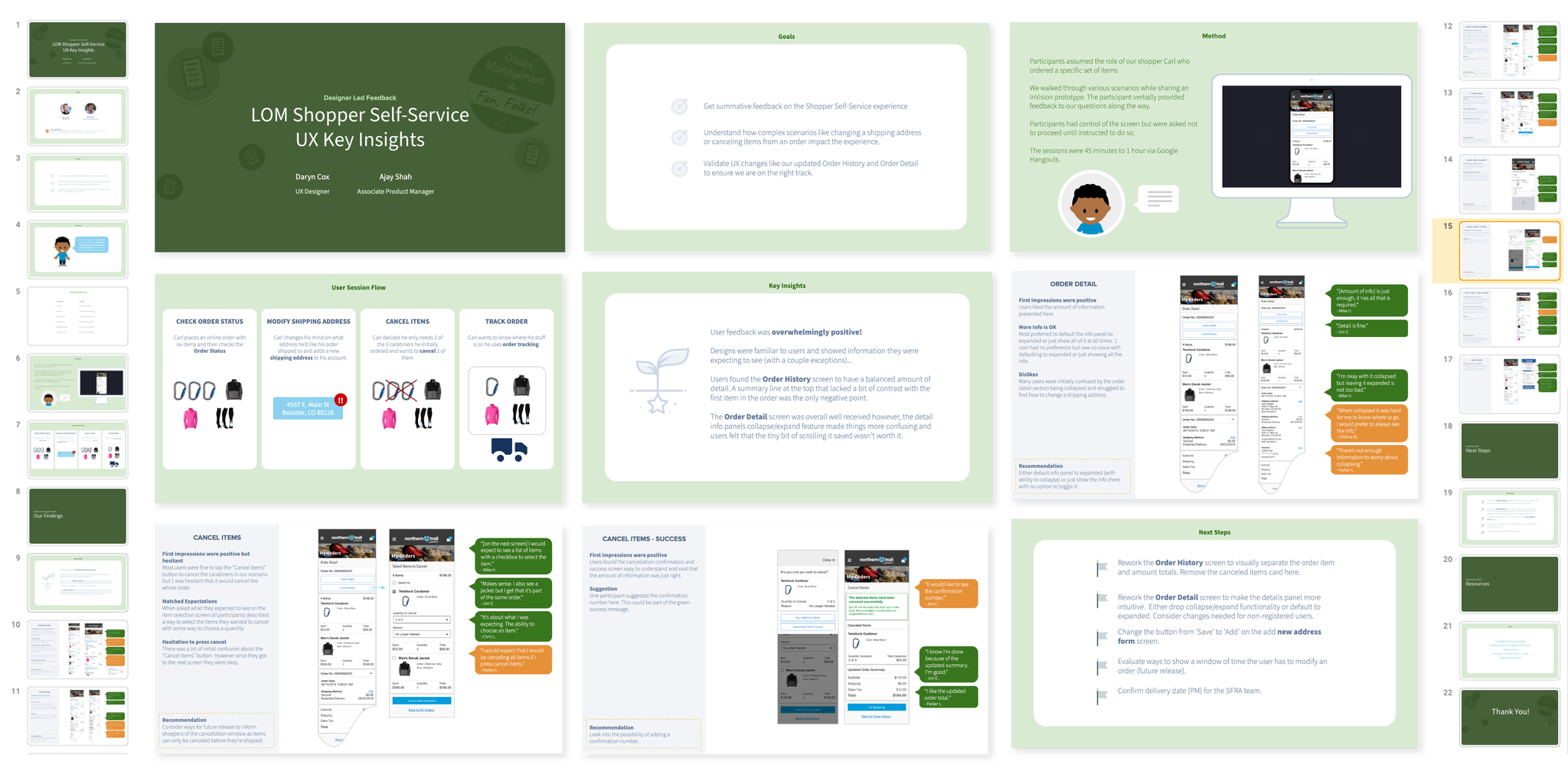
Research Findings Slide Deck
Once the research was complete and we felt that we had the right experience to begin development of our MVP solution, I packaged the findings into a comprehensive slide deck. This deck was presented to stakeholders, the extended UX team, PM’s and development as our single source of truth on this project.
Other Considerations
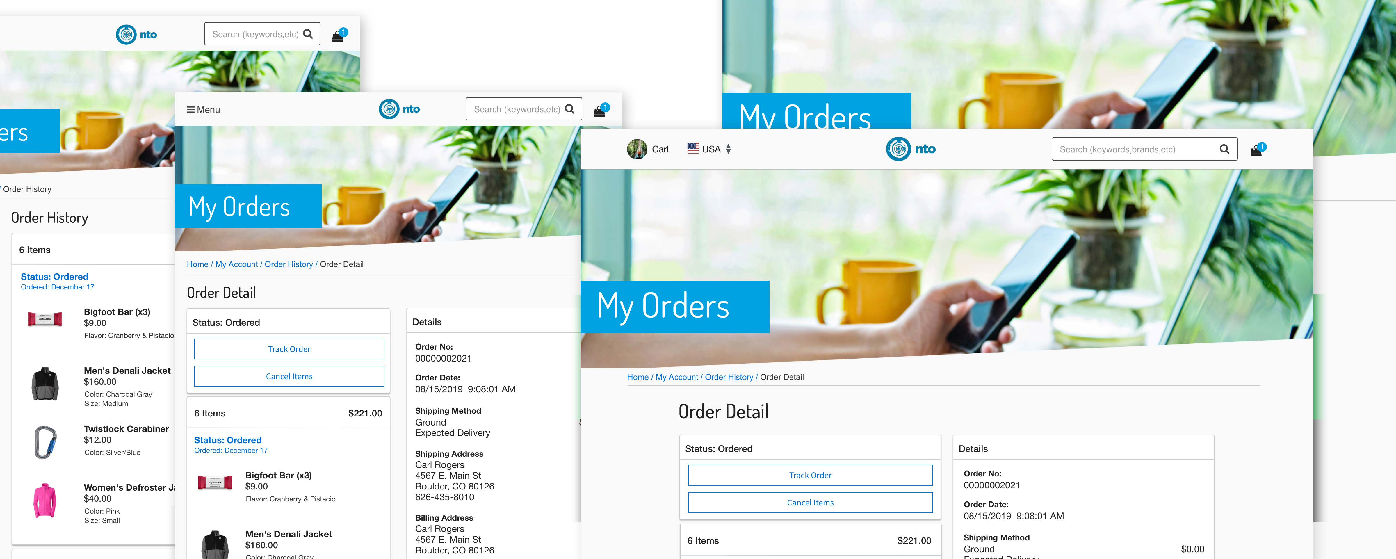
Designs were developed with mobile first in mind but we still needed to implement it for tablet and desktop screen resolutions in order to provide the best experience no matter what kind of device the shopper was using. To guide developers I created concepts of key screens in responsive layout sizes and kept myself available for consultation throughout development of the project.
